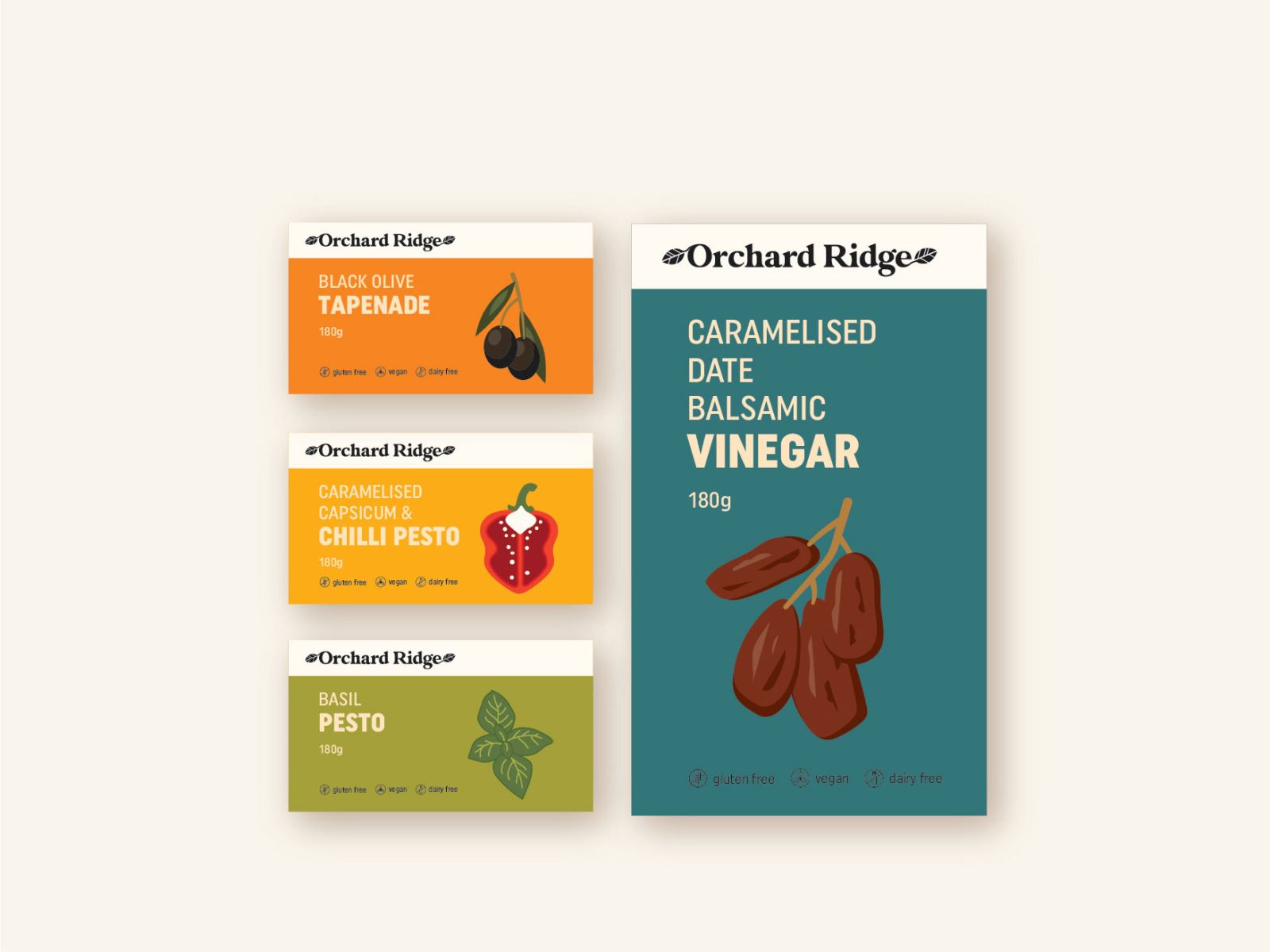
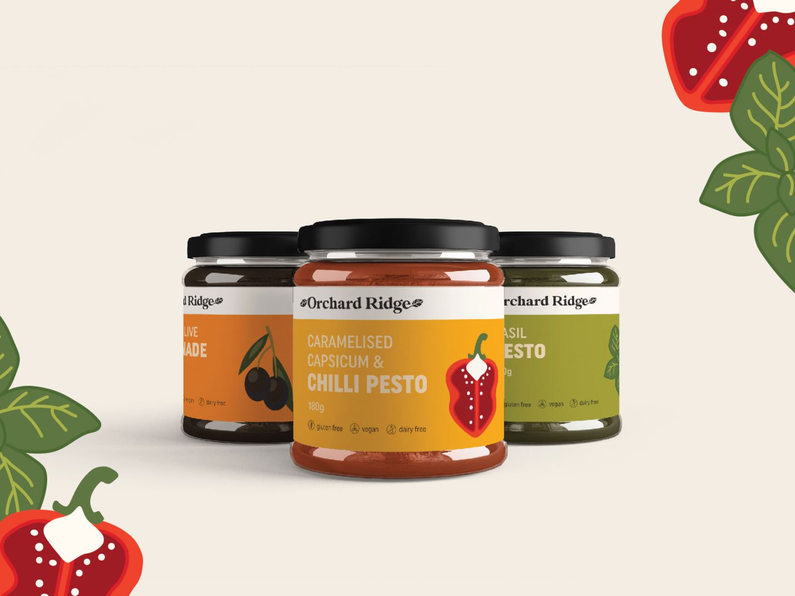
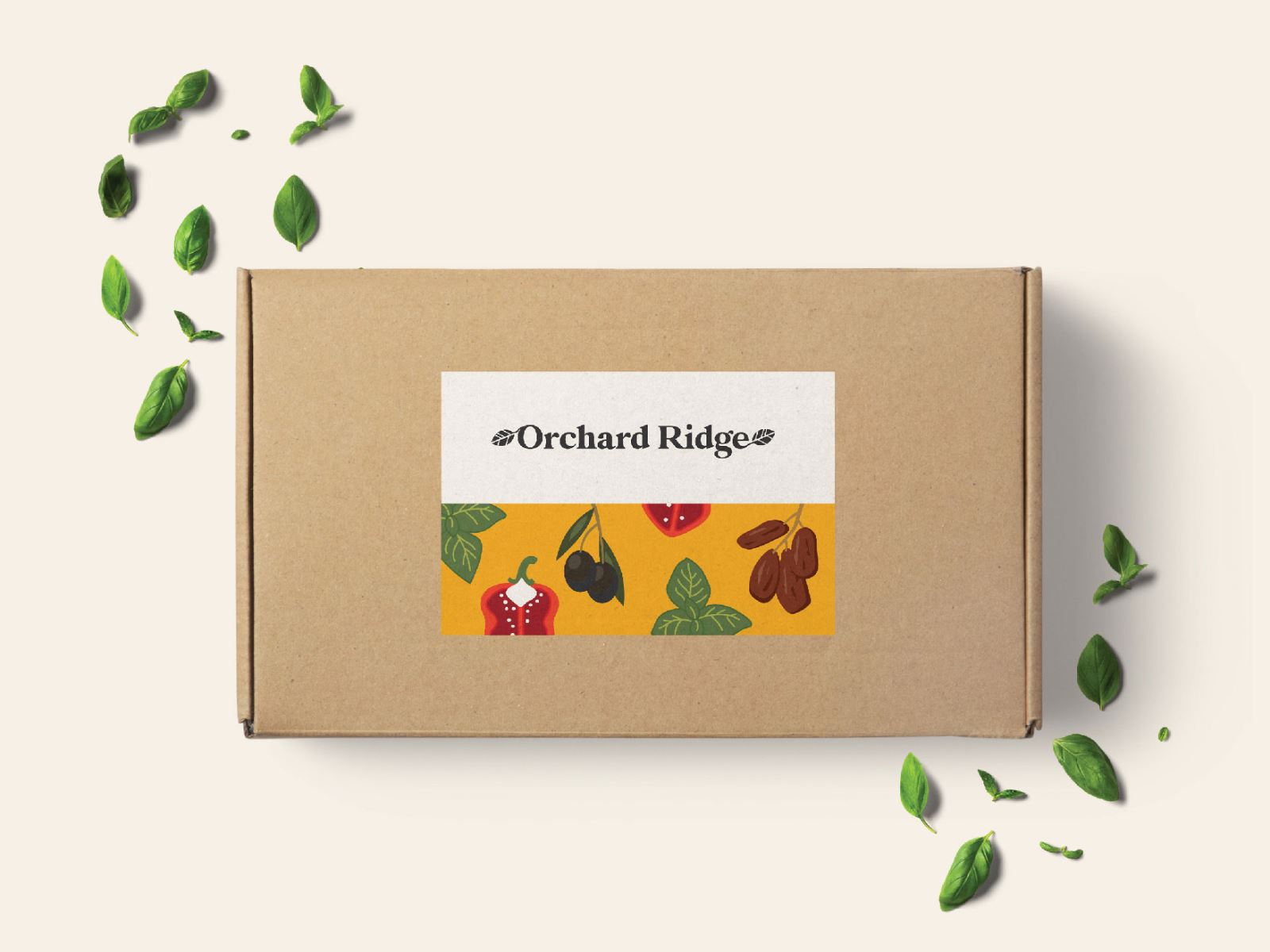
Orchard Ridge - Label Design

Inspired by the rich agricultural heritage of Somersby, Orchard Ridge was born out of a deep-rooted appreciation for fresh, locally-sourced ingredients. The journey of Orchard Ridge is a celebration of traditional craftsmanship blended with modern culinary innovation. Their dedication to crafting premium condiments is evident in every bottle, where we harness the finest Australian produce to create flavours that are both unique and authentic.

Guided by a commitment to quality and a passion for excellence, the team has meticulously honed recipes that resonate with the essence of the region. Each product is a tribute to the bountiful orchards and the vibrant, fresh flavours that define our brand. Through continuous refinement and a respect for time-honoured techniques, Orchard Ridge delivers products that not only satisfy the palate but also tell a story of heritage and craftsmanship.


Brand Vision

The vision for Orchard Ridge is rooted in celebrating the authentic taste of Australia, drawing from the natural abundance of Somersby’s orchards and transforming it into a range of premium condiments. Orchard Ridge embodies a commitment to honouring the past while innovating for the future, creating products that speak to both tradition and contemporary tastes, and we worked on the package design to convey the legacy and modernity of the products aiming to stand out on the shelves.

In designing the brand identity for Orchard Ridge, we aimed to capture the essence of the land and the craftsmanship that defines it. The logo, illustrations and label design introduced are inspired by the lush orchards and the natural beauty of the region, symbolising freshness, quality, and a deep connection to the earth. The vision is to establish Orchard Ridge as a beacon of culinary excellence, where every product tells a story of heritage, sustainability, and the rich flavours of Australia.


Package Design, Australia Package Design, Package Design Australia, Condiment  Package Design, Food Package Design


Package Design, Australia Package Design, Package Design Australia, Condiment  Package Design, Food Package Design


Package Design, Australia Package Design, Package Design Australia, Condiment  Package Design, Food Package Design


Package Design, Australia Package Design, Package Design Australia, Condiment  Package Design, Food Package Design

Package Design, Australia Package Design, Package Design Australia, Condiment  Package Design, Food Package Design


Package Design, Australia Package Design, Package Design Australia, Condiment  Package Design, Food Package Design


Package Design, Australia Package Design, Package Design Australia, Condiment  Package Design, Food Package Design


Package Design, Australia Package Design, Package Design Australia, Condiment  Package Design, Food Package Design

Package Design, Australia Package Design, Package Design Australia, Condiment  Package Design, Food Package Design


Package Design, Australia Package Design, Package Design Australia, Condiment  Package Design, Food Package Design


Package Design, Australia Package Design, Package Design Australia, Condiment  Package Design, Food Package Design


Package Design, Australia Package Design, Package Design Australia, Condiment  Package Design, Food Package Design


WHAT WE CREATED

The brand identity we crafted for Orchard Ridge is a harmonious blend of tradition and modernity, reflecting the rich agricultural roots and vibrant flavours that define the brand. The wordmark we developed is both refined and approachable, designed to convey a sense of authenticity and connection to the land.

In the label design, we incorporated elements that pay homage to the lush orchards of Somersby, using bespoke illustrations that evoke the natural beauty of the region. Each label is meticulously designed to stand out on the shelf, with a focus on clarity and eye-catching details that capture the essence of Orchard Ridge.

Our package design extends beyond mere functionality; it’s a tribute to the craftsmanship and quality that Orchard Ridge represents. By combining contemporary design elements with a nod to traditional aesthetics, we’ve created packaging that not only protects the product but also tells the story of its origins. This design is a tactile expression of Orchard Ridge’s commitment to excellence, ensuring that each product is as visually appealing as it is delicious.


GC Graphic Design have been AMAZING to deal with (rebranding / new packaging / help with website look etc), highly recommend for anyone looking to overhaul current branding or start from scratch. It's an investment we should have made years ago - noticed an immediate & significant increase in social media reposting / engagement with products looking great, & also many more direct sales & orders from distributors with zero marketing effort / spend.
Regards Jeanie McClymont, Good Mix Superfoods