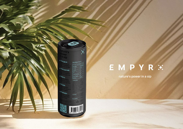
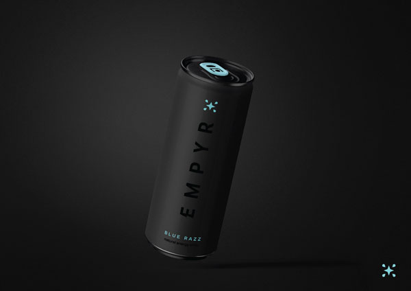
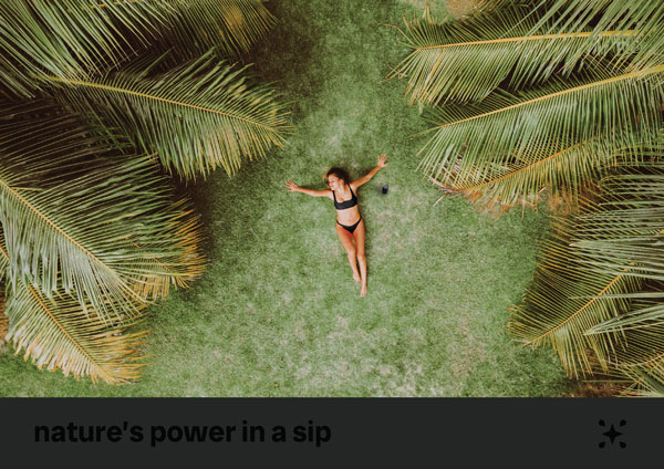
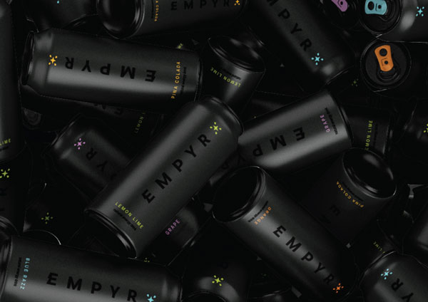
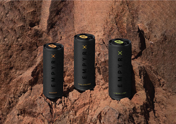
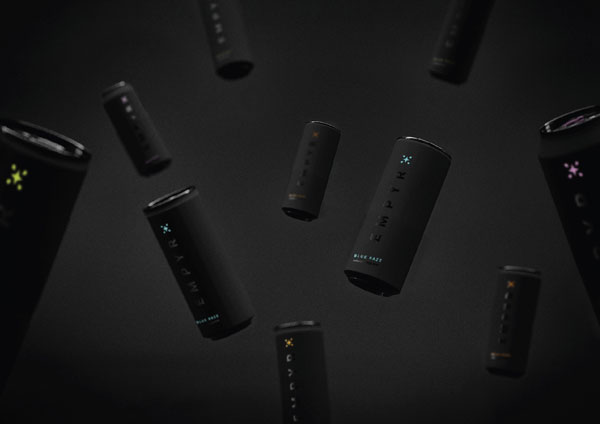
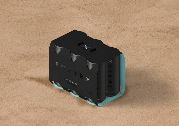
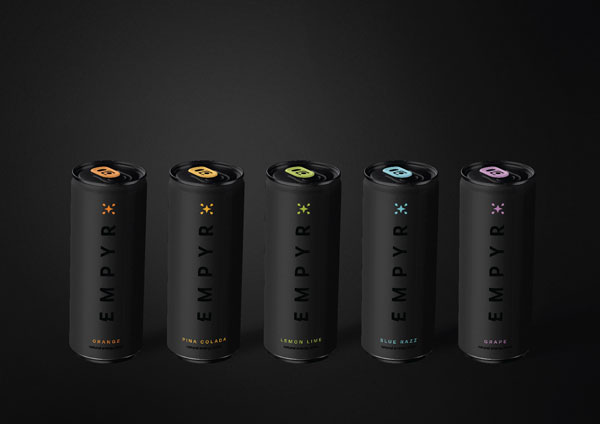
EMPYR Energy Drink Package Design

EMPYR redefines energy drinks by combining vitality and natural wellness. Our design approach was to create a brand identity that reflects its powerful ingredients and health-focused benefits, ensuring it stands out on shelves. Through thoughtful design, we developed the bold and dynamic Empyr Energy Drink Package Design, capturing attention and conveying its vibrant, natural energy.


Brand Vision

EMPYR embodies the fusion of energy and nature, offering a health-forward alternative in the energy drink market. Rooted in the idea of clean, natural ingredients and revitalising power, the brand brings together hydration, vitality, and wellness. Every aspect of EMPYR is crafted to promote energy without compromise, combining dynamic flavours with a sleek, modern brand presence. Its mission is to energise and inspire with every sip, making it a go-to for those seeking a refreshing boost.


Energy Drink Package Design, Energy Drink Label Design,  Australia Package Design, Package Design Australia


Energy Drink Package Design, Energy Drink Label Design,  Australia Package Design, Package Design Australia


Energy Drink Package Design, Energy Drink Label Design,  Australia Package Design, Package Design Australia

Energy Drink Package Design, Energy Drink Label Design,  Australia Package Design, Package Design Australia


Energy Drink Package Design, Energy Drink Label Design,  Australia Package Design, Package Design Australia


Energy Drink Package Design, Energy Drink Label Design,  Australia Package Design, Package Design Australia


Energy Drink Package Design, Energy Drink Label Design,  Australia Package Design, Package Design Australia


Energy Drink Package Design, Energy Drink Label Design,  Australia Package Design, Package Design Australia


Energy Drink Package Design, Energy Drink Label Design,  Australia Package Design, Package Design Australia


WHAT WE CREATED

Our work on the Empyr Energy Drink Package Design began with a custom logo featuring a bold "E" with a lightning bolt in its negative space, symbolising power and vitality. The brand symbol merges a drink drop and spark into a flower, representing both hydration and health. The sleek, modern can designs use flavour-specific colour schemes, vibrant accents, and clean typography to enhance shelf appeal. Each design element—from the custom typography to the cohesive layout—was thoughtfully crafted to create an energetic, standout brand that resonates with its audience.


Highly recommend! They are innovative, creative, and results-driven.
Gus and Isac are very professional and knowledgeable.
My new packaging is amazing. Thanks!


Ana Paula Romanach – Armaiti